PREFLET
DASHBOARD REDESIGN
Overview
ROLE.
UX researcher, UX/UI designer
Timeframe.
10 days solo project
TOOLS.
Figma, Notion
Context
Preflet is a SaaS start-up that offers an AI-driven energy management platform for commercial buildings. Their mission is to optimize energy consumption, reduce costs, and cut carbon emissions. They do this by harnessing the power of artificial intelligence.
challenge
For this project Preflet wanted to have a more comprehensive and user-friendly dashboard, displaying all important energy metrics and an Insight page where the users can find detailed information about energy consumption, allowing them to access in-depth insights. The goal of the redesign was to improve user experience, usability, and ensure easy access to relevant data and insights.
01 Research

MARKET ANALYSIS
USABILITY TESTING


PROTO-PERSONA

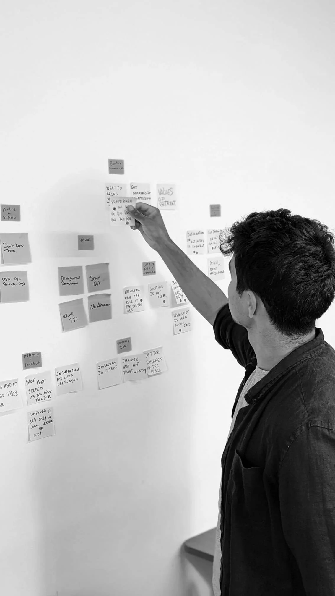
AFFINITY MAP

DASHBOARD RESEARCH
INTERVIEWS
The project started with a meeting with the stakeholders to align everyone's understanding of the project scope.
It also served as a platform for the Preflet team to share their insights, feedback, and concerns. This valuable input could help in the decision-making process and ensure that the end product fulfills the expectations and requirements of all stakeholders.
I began my research by conducting a market analysis to gain a holistic understanding of the energy consumption industry. I identified 6 essential elements an energy consumption dashboard should have to provide a comprehensive overview and facilitate effective decision-making. Here are some must-haves for an energy consumption dashboard:
MARKET ANALYSIS
Real-time Data
Display real-time or near real-time data to keep users informed about the current energy consumption status.
01
Energy Efficiency Metrics
Include metrics related to energy efficiency, such as total energy consumption, and energy cost. These metrics enable users to assess their energy efficiency efforts.
02
Visualizations
Utilize intuitive and visually appealing charts, graphs, and diagrams to present data in a clear and understandable format. This allows users to quickly grasp trends and patterns.
03
Comparative Analysis
Provide the ability to compare energy consumption data across different time periods, locations, or benchmarks. This feature helps users identify areas of improvement.
04
Historical Data
Provide access to historical energy consumption data to track performance over time and identify long-term trends.
05
Alerts and Notifications
Incorporate alerts and notifications to notify users about abnormal energy consumption patterns, potential cost overruns, or other important events that require attention.
06
The current app
Following the market research, the initial step involved conducting usability testing and analyzing the existing application to pinpoint the most critical pain points and areas that require improvement.
To carry out the testing process, I evaluated the app with 3 potential users of the app and additionally gathered feedback from 5 building owners who possess experience with energy dashboards.
Current dashboard
Current insight page
USABILITY TESTing insights

“The information on the insights page is confusing, I am not sure what some of the numbers mean”
“The graphs are confusing and it’s difficult to read the labels”
“I am confused about how the filter works, I would like to be able to see specific date ranges in the past”
“There is no possibility to bench mark the information with other data”
“I do not know what some of the titles of graphs and labels mean.
Interviews
Following the completion of the usability testing and identification of the main pain points of the testers, I decided to gather further insights into how building owners manage their energy consumption. To achieve this, I conducted interviews with multiple building owners and subject-matter experts (SMEs).
Interview insights
Expenses data is most important for users
01
Users aspire to align their metrics with a goal they set
0 2
Users want to benchmark data with industry standards
0 3
Users want comprehensive graphs
0 4
PROTO-PERSONA
After collecting all the gathered insights, I developed a proto-persona instead of a user persona due to the fact that my research was based on hypothetical users during Preflet's pilot phase. The proto-persona allows me to effectively define the problem statement by encapsulating the needs, wants, and pain points of a single user.

Sandra Fernandes
42, female
Building Manager
She works for a commercial real estate company that owns and operates multiple buildings in Lisbon. Sarah is passionate about sustainable practices and has been actively involved in initiatives to reduce energy consumption, save expenses, and minimize the carbon footprint of the buildings she manages.
Data-driven insights
Recommended actions to safe energy
Comprehensive analytics
NEEDS
Cost reduction
Improve energy efficiency
Minimize environmental impact
GOALS
02
PROBLEM DEFINITION
Through the process of creating the proto-persona, I could develop a clearer picture of the users' needs, desires, and challenges. Based on those pain points I developed the problem statement.
Problem statement
Sandra needs a comprehensive and actionable dashboard to analyze and track energy consumption because the lack of key information hinders her ability to effectively reduce costs and minimize the carbon footprint of the building.
How might we
01
How might we help Sandra to find the relevant data and insights she is looking for?
02
How might we clarify the information being showcased on the dashboard?
03
Ideation
Based on the research, as well as the design challenge, I defined some goals and features here are the goals I am proposing to achieve:
Redesign the filter to enhance precision, enabling users to select specific dates and navigate through time more effectively.
01
Incorporate a feature that enables users to create goals, facilitating the alignment of their energy metrics and providing a framework for tracking progress and performance.
02
Integrate a feature that assists users in benchmarking their energy metrics against both previous periods and industry benchmarks, enabling them to compare and evaluate their performance effectively.
03
Enhance the graphs to create a more comprehensive visual representation that is easily understandable and provides actionable insights to the users.
04
04
Design
Key Dashboard
Principles
Before proceeding with prototyping, I conducted extensive research on dashboards. It is crucial to recognize the significance of proper dashboard design, as inadequately designed dashboards can hinder the effective communication of valuable information and insights. Moreover, they have the potential to reduce the comprehensibility of the data compared to its original form. Through my research, I identified 4 fundamental principles of dashboard design that should be considered.
Effective information presentation
01
Always begin with a clear understanding of the end-users the dashboard is intended for.
Visual consistency
0 2
Clear dashboard design is ensured and delivered through consistent adherence to and use of typography, colors, and graphic elements.
Efficient interactions
0 3
It is important to eliminate unnecessary graphical elements, align filters and interactions with the user's workflow
Effective use of language
0 4
Language is as much a design for user experience tool as color, font, and style.
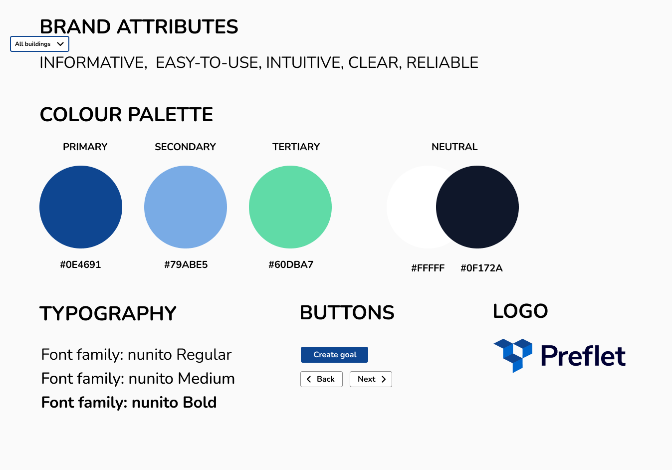
BRANDING
05
TESTING & ITeRATIONS
During this phase, I conducted two rounds of testing to ensure the coherence and effectiveness of my low-fidelity designs before progressing to mid-fidelity prototypes and finally the high-fidelity prototype. Below, I have outlined the primary differences observed between these 3 fidelity levels.
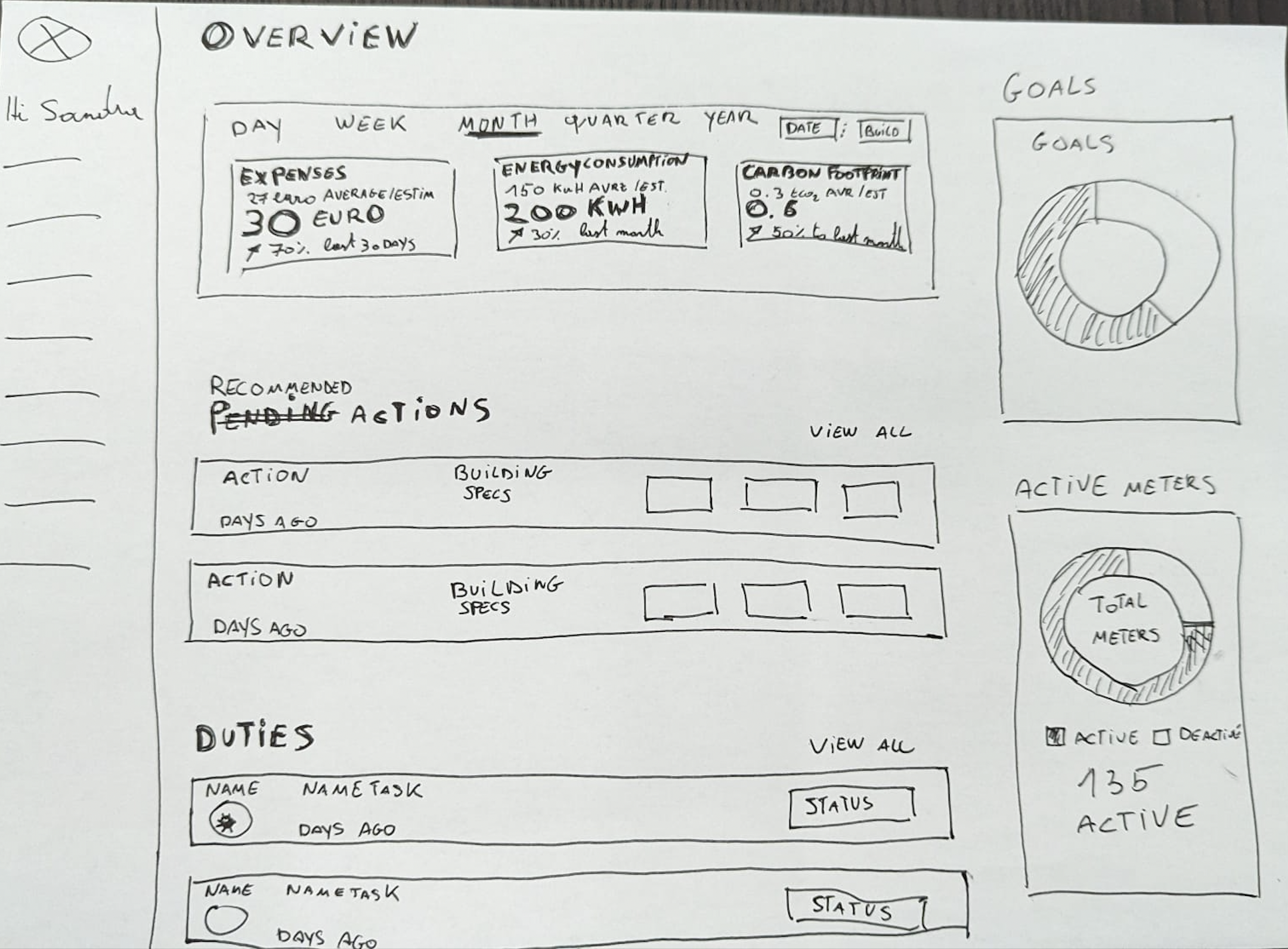
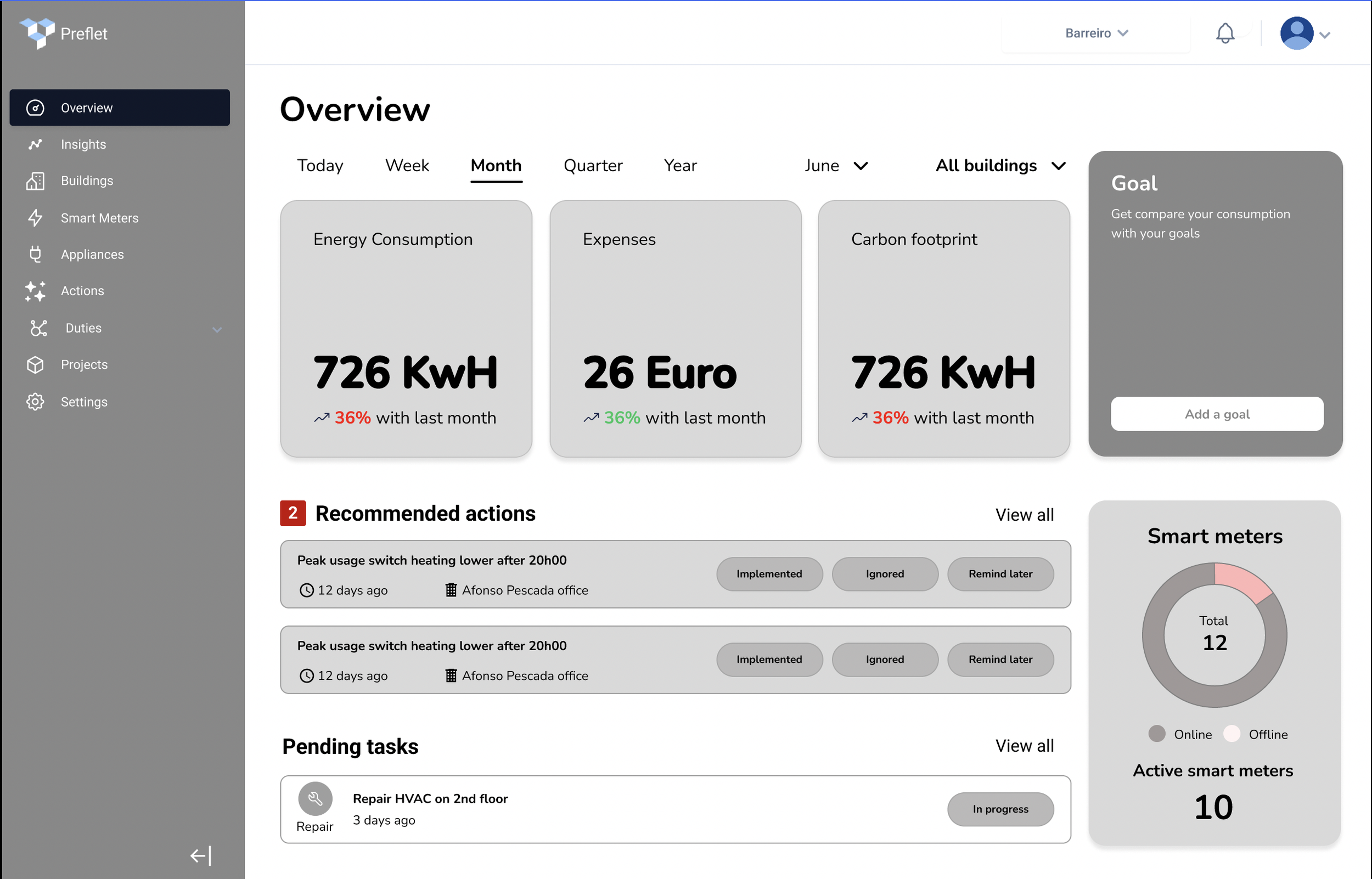
Low-fi prototype Overview page
Mid-fi prototype Overview page
Implemented the addition of action count within the actions section, aiming to provide users with a clear indication of the number of actions that require their attention.
Addressed the issue of user confusion by renaming the section previously labeled as "Duties." The new name assigned to this section is "Pending Tasks," as it was found to be more intuitive and user-friendly during testing.
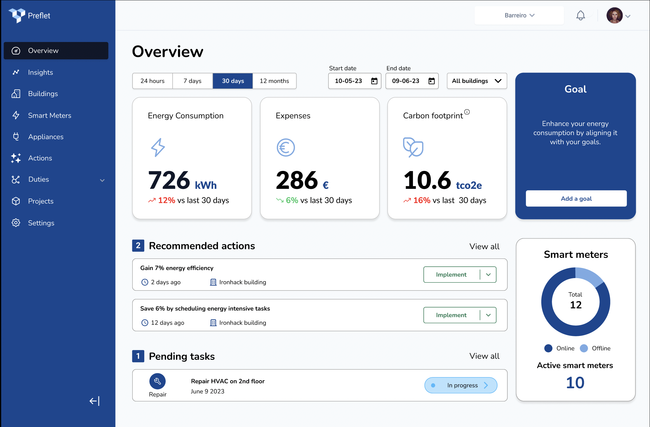
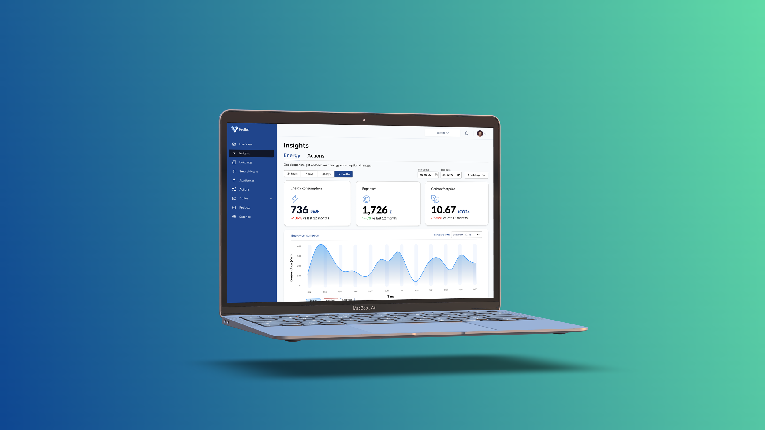
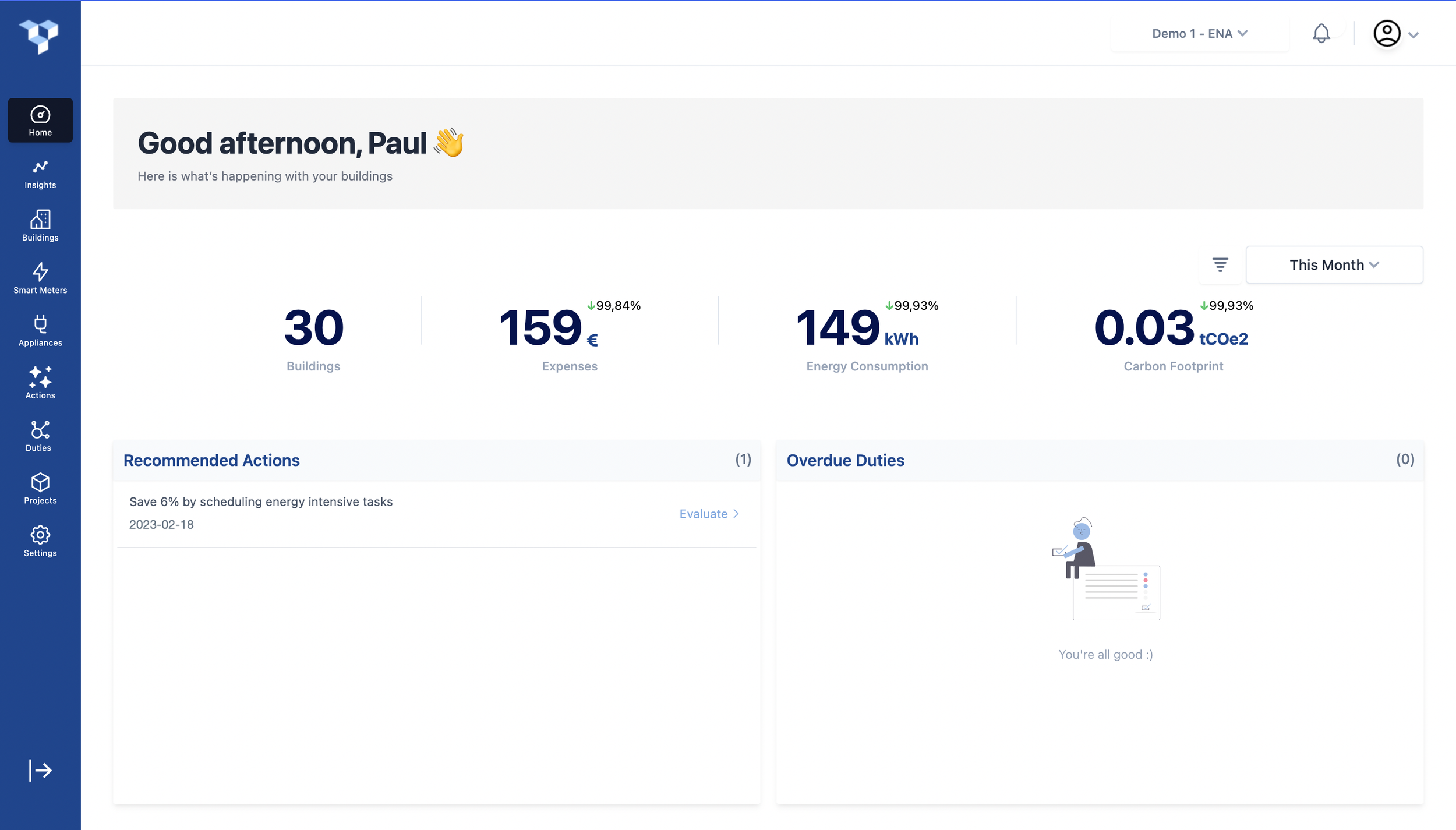
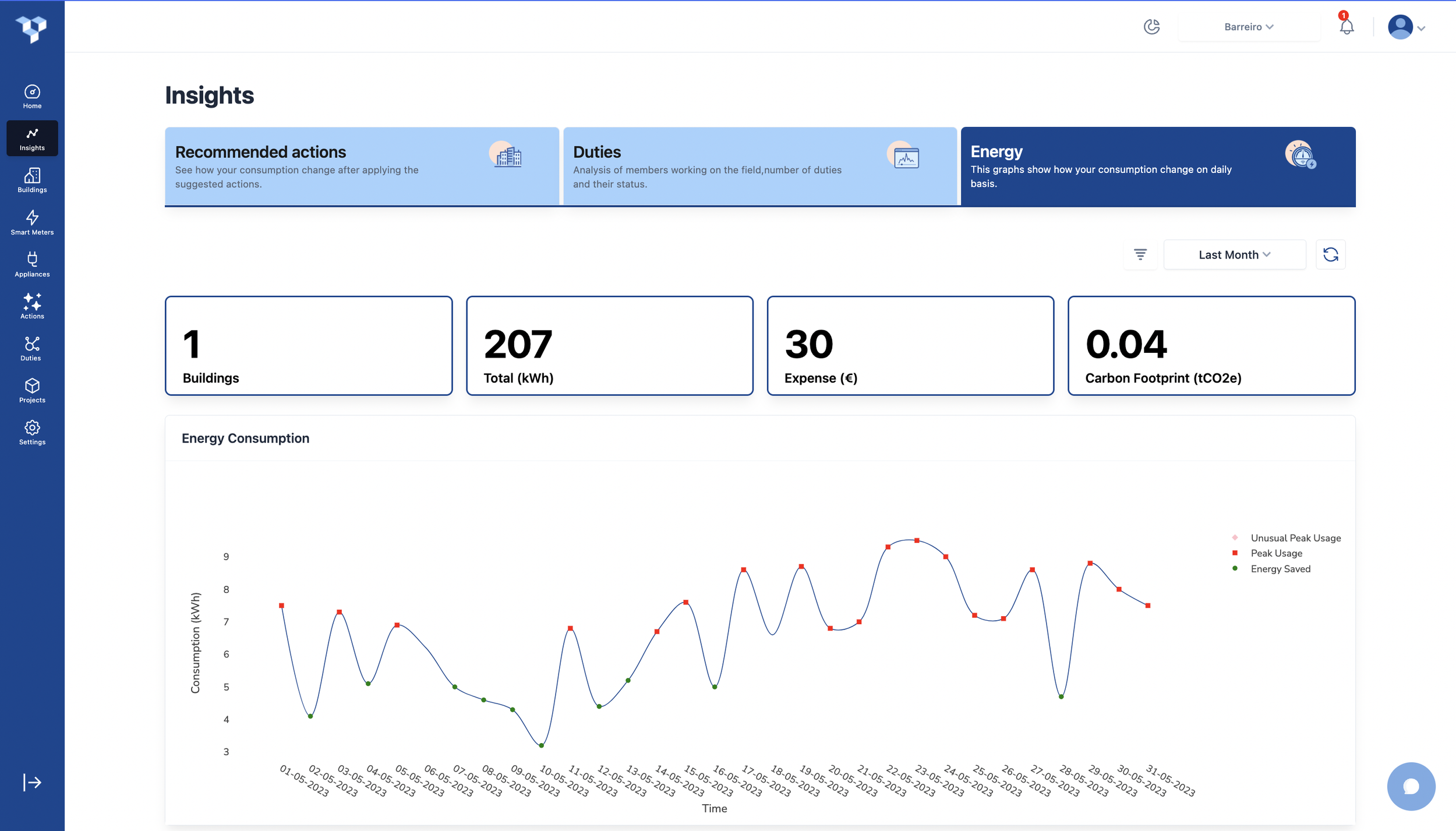
High-fi prototype Overview page
Enhanced the filter functionality to provide a more specific date range by adding an end date. I replaced it with "30 days." This modification resulted in improved clarity, as users found the term "30 days" to be more understandable and precise in the context of the filter.
To minimize the cognitive load on the dashboard, I simplified the buttons within the action card. While the "implemented" option remains visible on the card, I streamlined the interface by introducing a dropdown menu for accessing other options. This design change allows users to easily access additional actions by simply clicking on the dropdown, providing a more intuitive and efficient user experience.
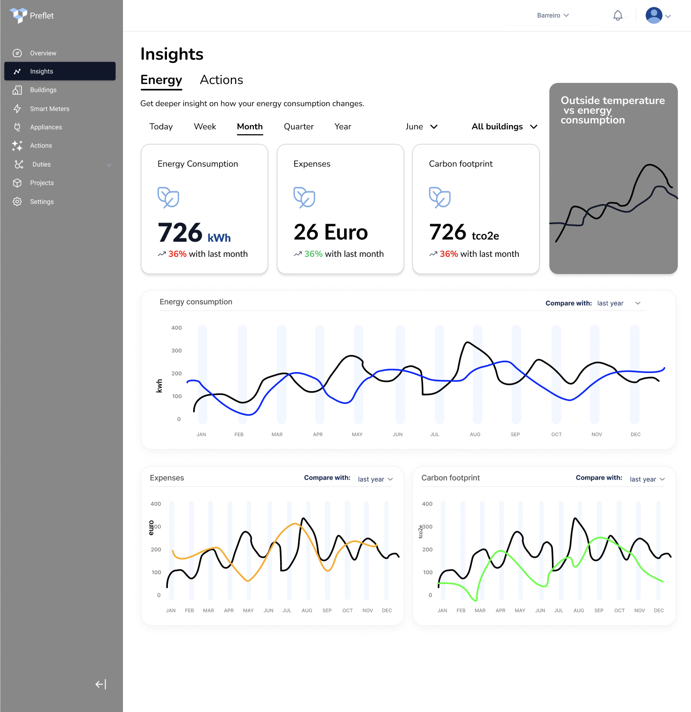
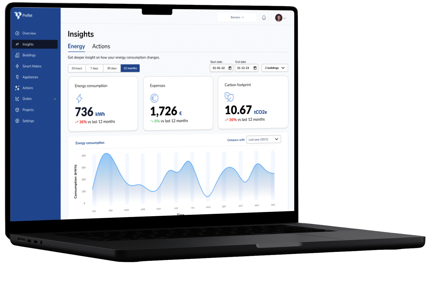
Mid-fi prototype Insight page
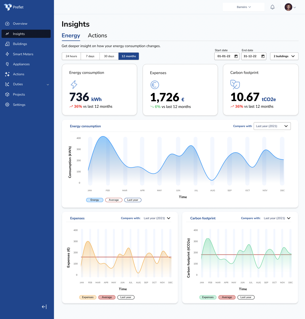
High-fi prototype Insight page
Conducted quantitative research to determine the preferred metrics for users. The results indicated that the temperature/energy consumption graph was not considered essential by the users and was therefore not on the high-fidelity prototype.
Implemented the addition of buttons on the graphs, allowing users to display multiple graph lines and enabling them to compare data effectively. This feature enhances the user experience by providing the option to visually analyze and compare different data sets within the graphs.
06
FINAL MOCKUPS
07
Next steps
Enhance the gamification elements within the goals section on the overview page to create a more immersive experience.
01
Continuously enhance and expand the functionality of the mobile app version
0 2
Generate a comparative graph illustrating the performance of the same period this year in relation to the corresponding period of the previous year.
0 4
Include interactive graphs that enable the comparison of energy consumption among different buildings.
0 5
08
Learnings
It was fascinating to learn about the dynamics between the client and myself as a designer. I realized that while understanding and meeting the needs of the users is crucial, it is equally important to align with the client to ensure effective collaboration and create a final product that satisfies all stakeholders. Below are some of the other learnings of this project.
I am happy to share that after delivering the project, I have maintained an ongoing collaboration with Preflet, dedicated to enhancing the SaaS platform. During this period, I have reevaluated the entire app's information architecture, revamped all pre-existing pages, and prioritized user-centric design principles. Currently, I am actively engaged in designing an onboarding experience for Preflet users. Upon the completion of these initiatives, I will compile case studies to showcase in my portfolio. Stay tuned!
Bobby project
*
Bobby project *
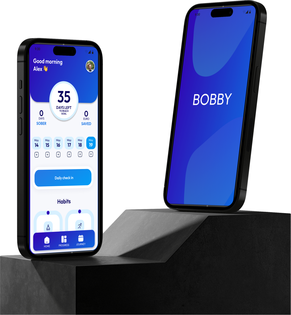
Check out Bobby, the alcohol consumption tracking app. A solution for users who want to reduce their alcohol consumption, but have never done so digitally or were unsuccessful in trying to make this practice a daily habit.